Overview
Visualize any data with AI suggestions in shareable dashboards
Your data gets pretty with interactive visualizations. In the background we do teh math and statistics for you to recommend teh most suitable plots. You can also activate AI agent support that runs an LLM to have a flawless experience.
The customization options are endless, not just because there are over 40+ plot types available but because you can use a custom plot and write code in an environment specifically setup for you to bring your data to life.
Once you are happy with your plots, ask the AI builder agent for support with intrepretation and description and invite your team to your art work.
Getting Started
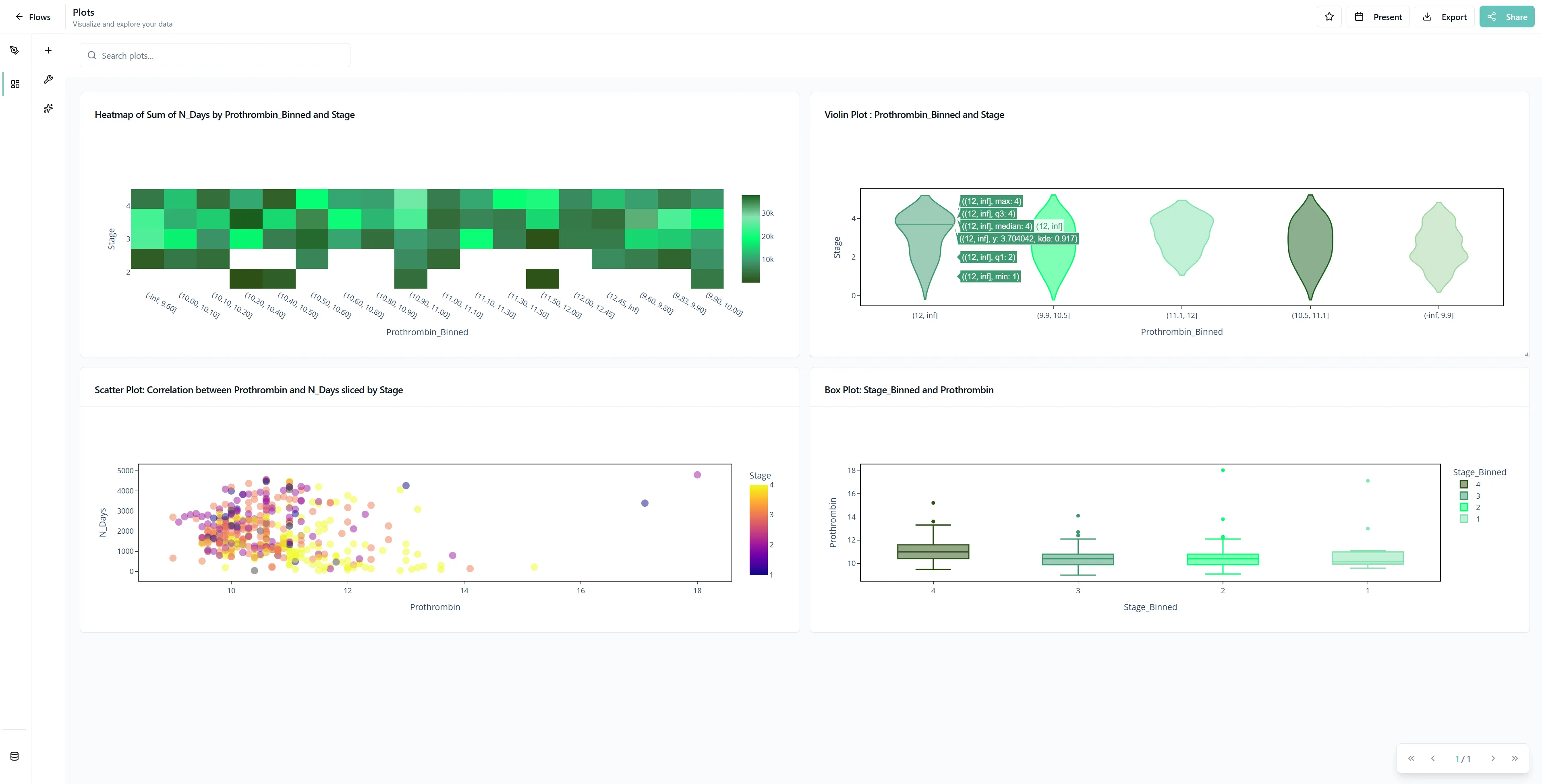
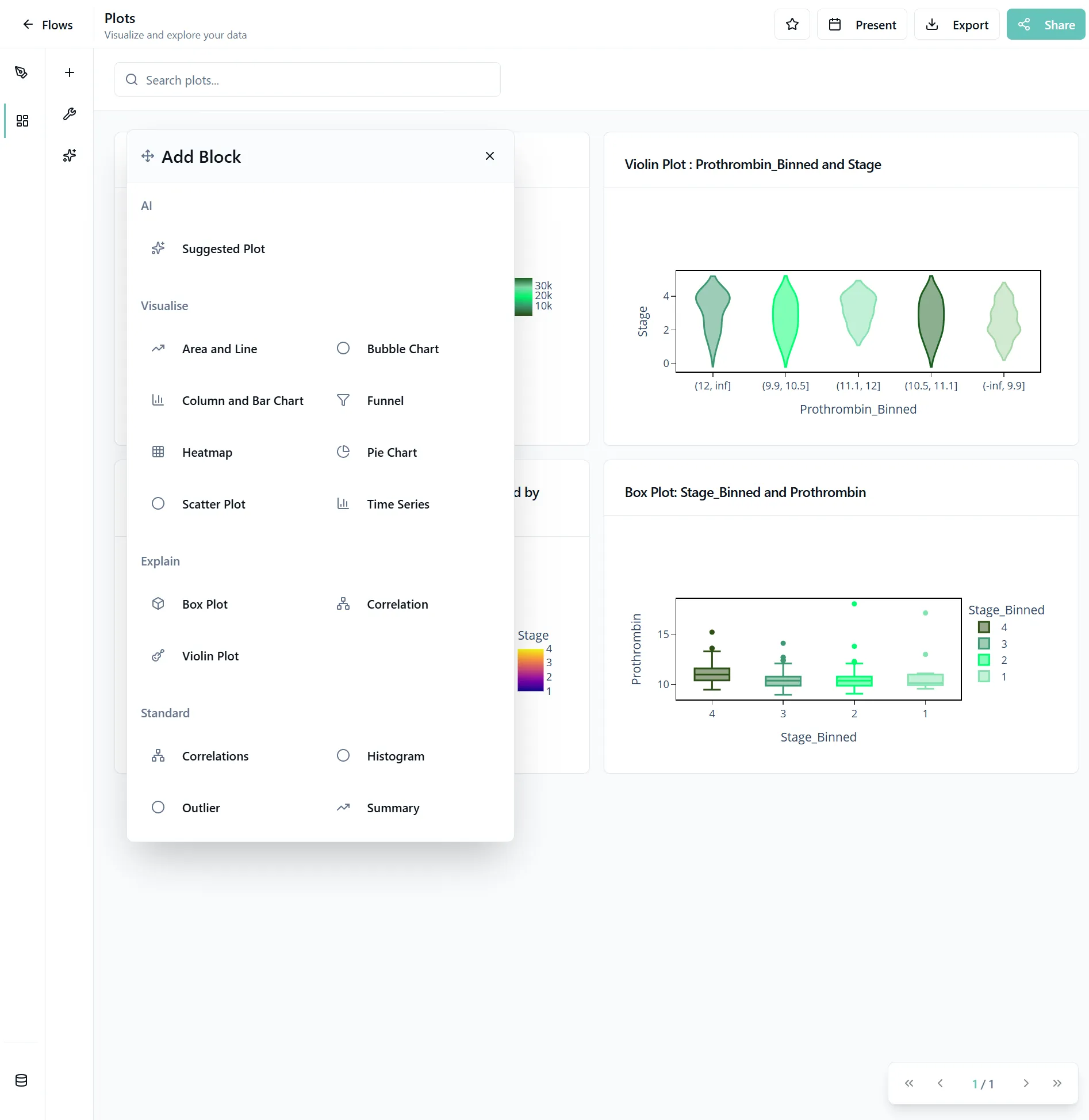
1. Navigate to the Plots Page
Navigate to the Plots Page and click on the plus icon to open the different plot types and select one.

Choose Your Visualization
Not sure which plot to use? Explore our interactive gallery below to find the perfect visualization for your data story.
A quick statistical snapshot in a compact box. See median, quartiles, and outliers at once.
Show how the whole pie gets divided into slices. Great for market share and percentages.
Not sure which one to pick? Try our AI-powered suggestions - they'll analyze your data and recommend the best visualizations for your specific use case!
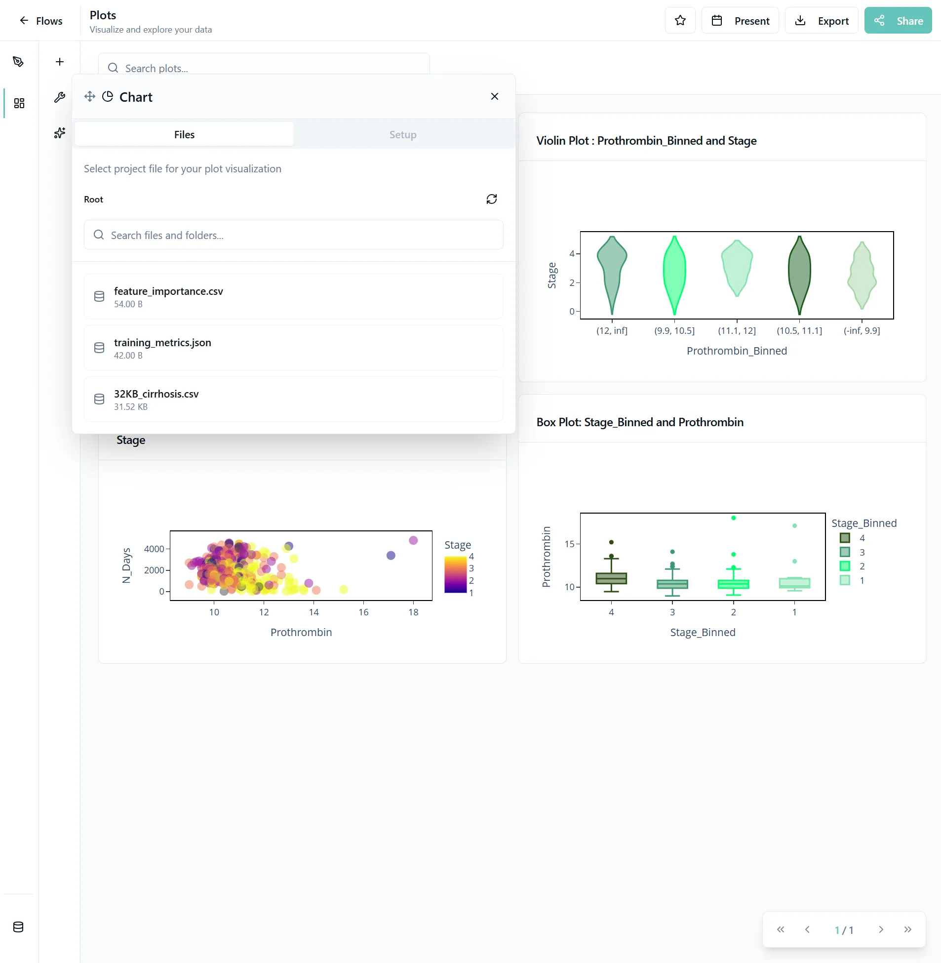
2. Select Your Data
Choose which data blob you want to use for your plots.

3. Configure Plot Settings
A page with different settings will open. You'll see dropdowns where you can select your choices. These options are based on the automatically generated metadata of your files.
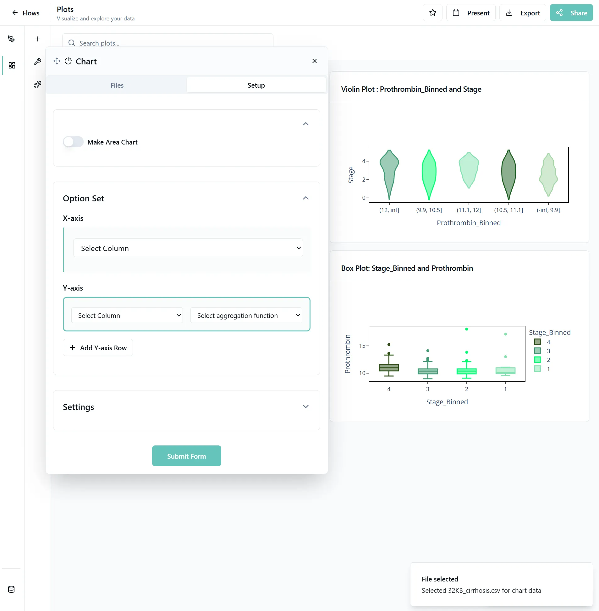

Tip: If you get an error message, check if you used the same columns in different settings. Sometimes this is allowed, sometimes this can cause issues. If something seems off, check the metadata settings for your data. Some settings are not compatibel with eachother.
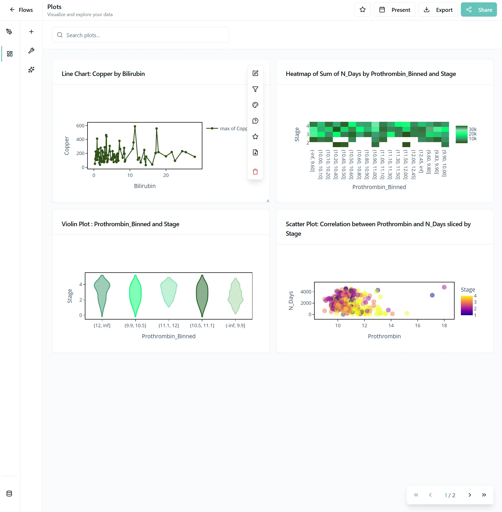
4. Submit and Interact with Your Plot
Click Submit Form to create your plot. Once created, hover over the plot to see the plot toolbar, where you can:
- Change all settings
- Filter data
- Mark the plot as favorite
- Change the colors of a specific plot

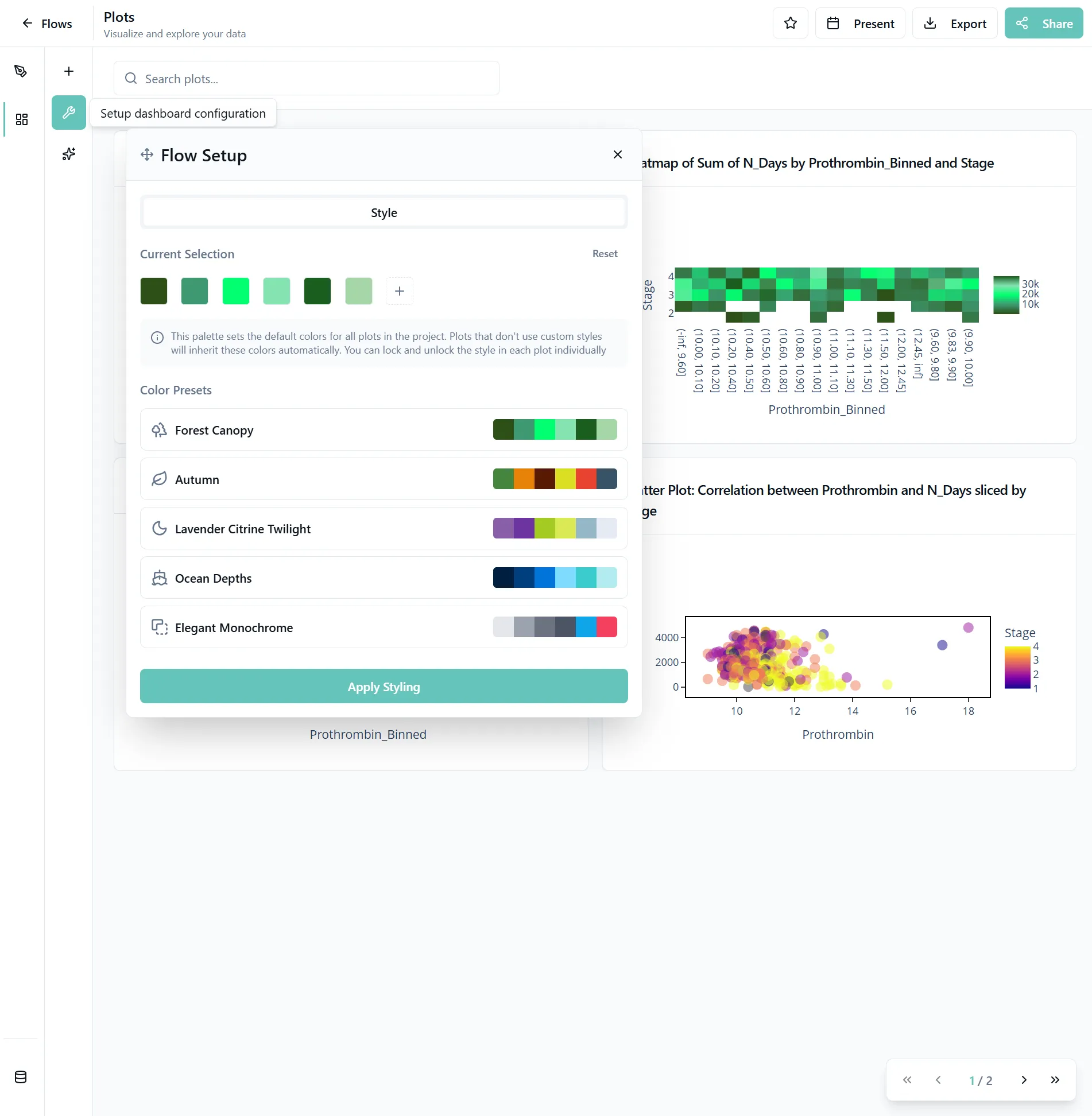
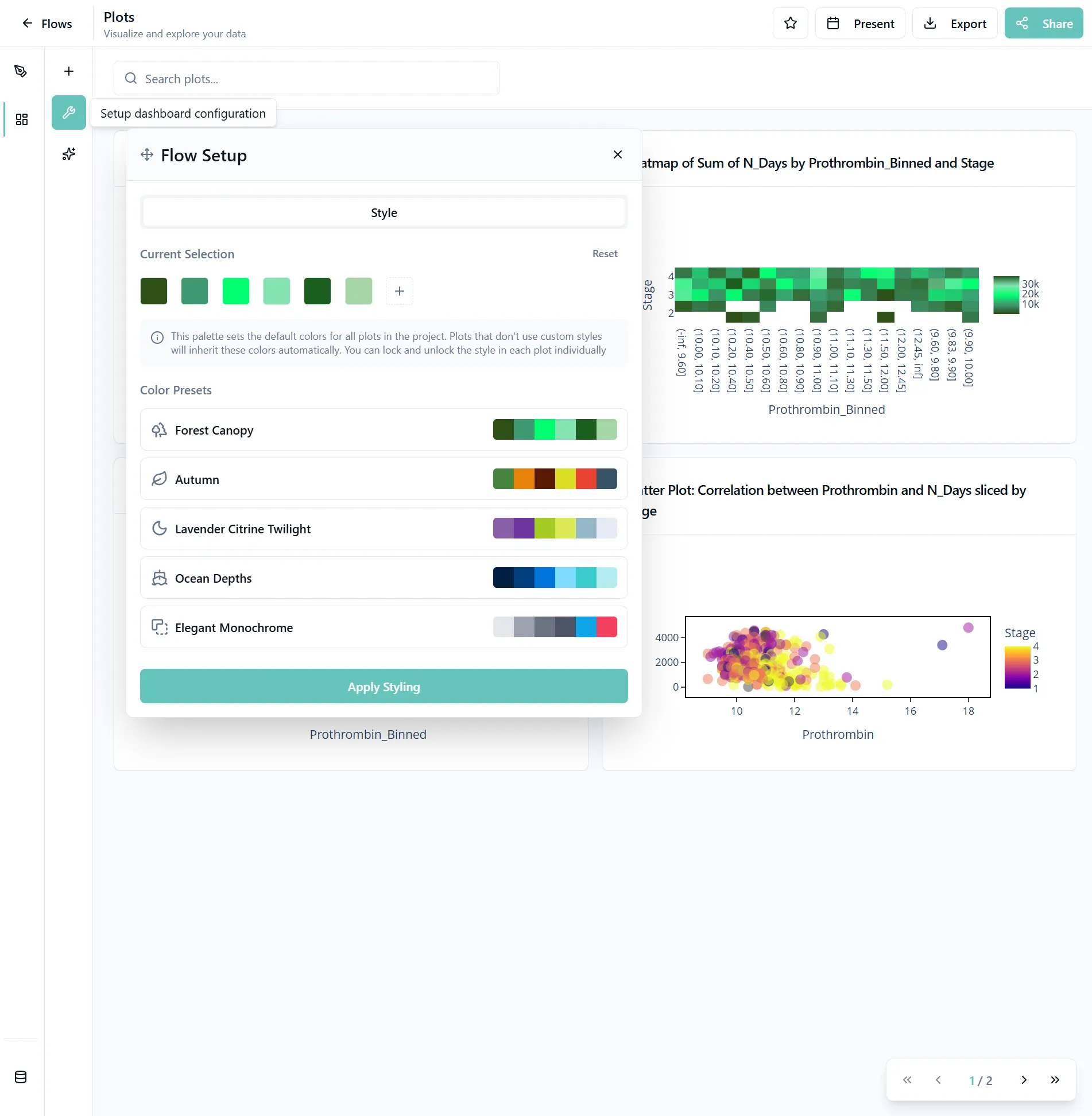
5. Customize Colors and Styling
To customize colors and styling for all plots, click on the tool icon. Choose from predefined palettes like Ocean Depths, Forest Copy, and more. Depending on the number of plots, it could take a minute to apply your changes.
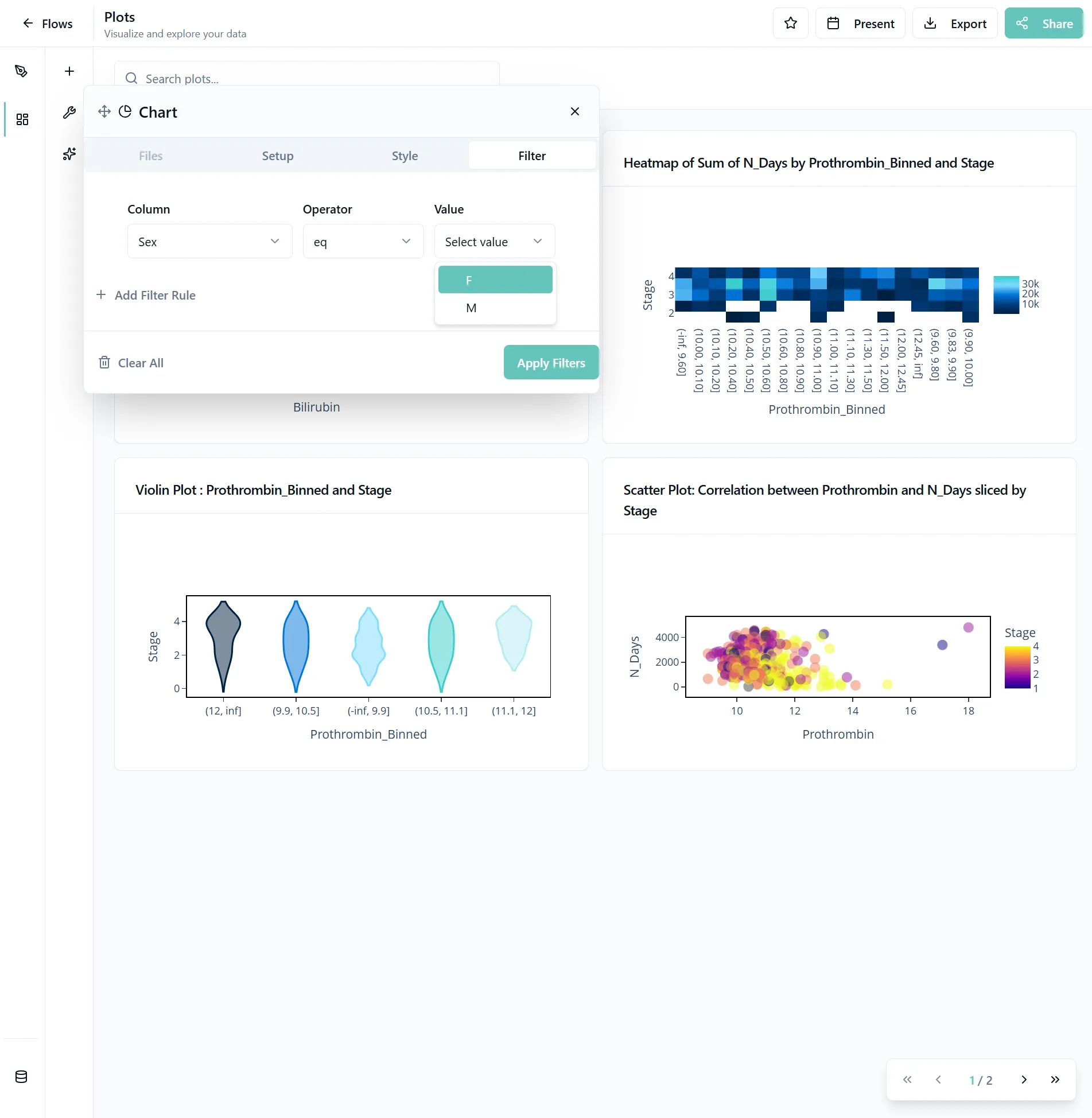
6. Apply Filters
Apply filters to focus your analysis on specific data subsets. For example, to filter for female participants, hover over the plot and click on the filter icon.
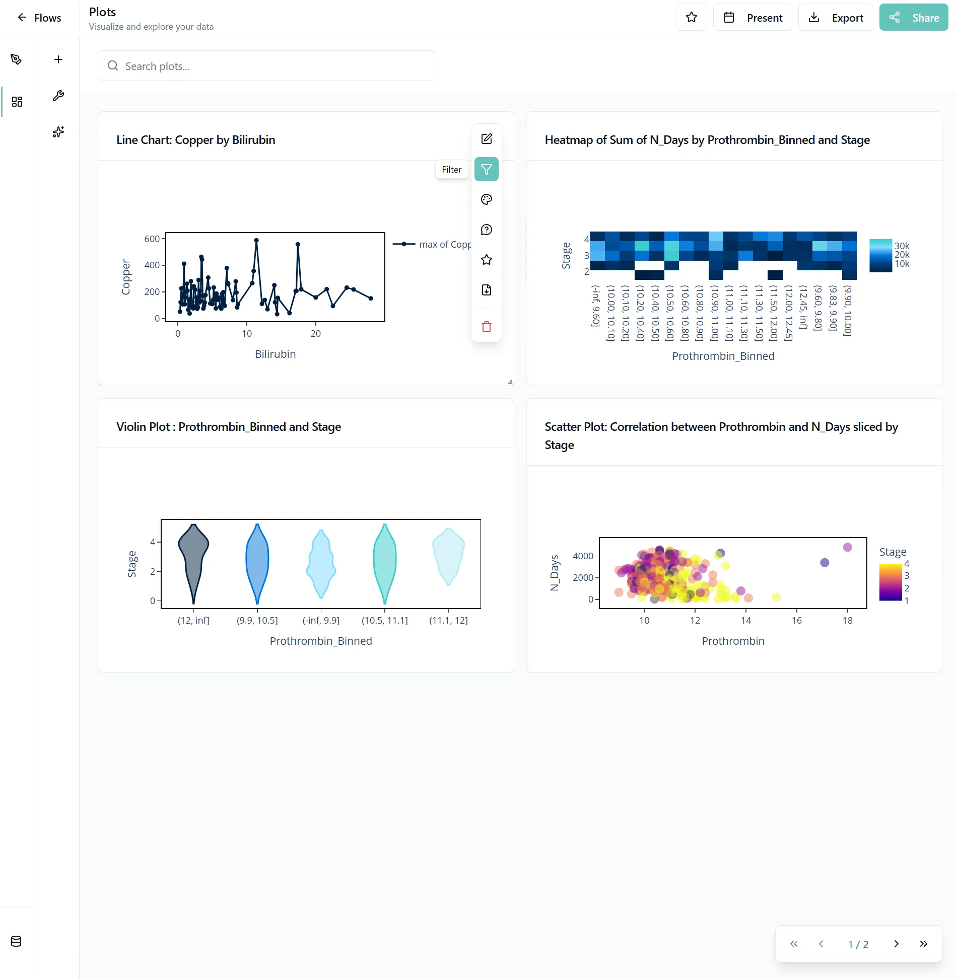

Apply your filters using the smart selection support. Plots update instantly as you filter.

Advanced Filtering
- Date Range Selection: Focus on specific time periods
- Category Filtering: Show or hide specific categories
- Custom Conditions: Create complex filtering logic with multiple conditions
- Smart Selection: Use intelligent filters that understand your data
7. Use AI-Suggested Plots
To add relevant plots that you might have missed, click on the plus button and select Suggested Plots at the top of your plot types. You can also start with this step.
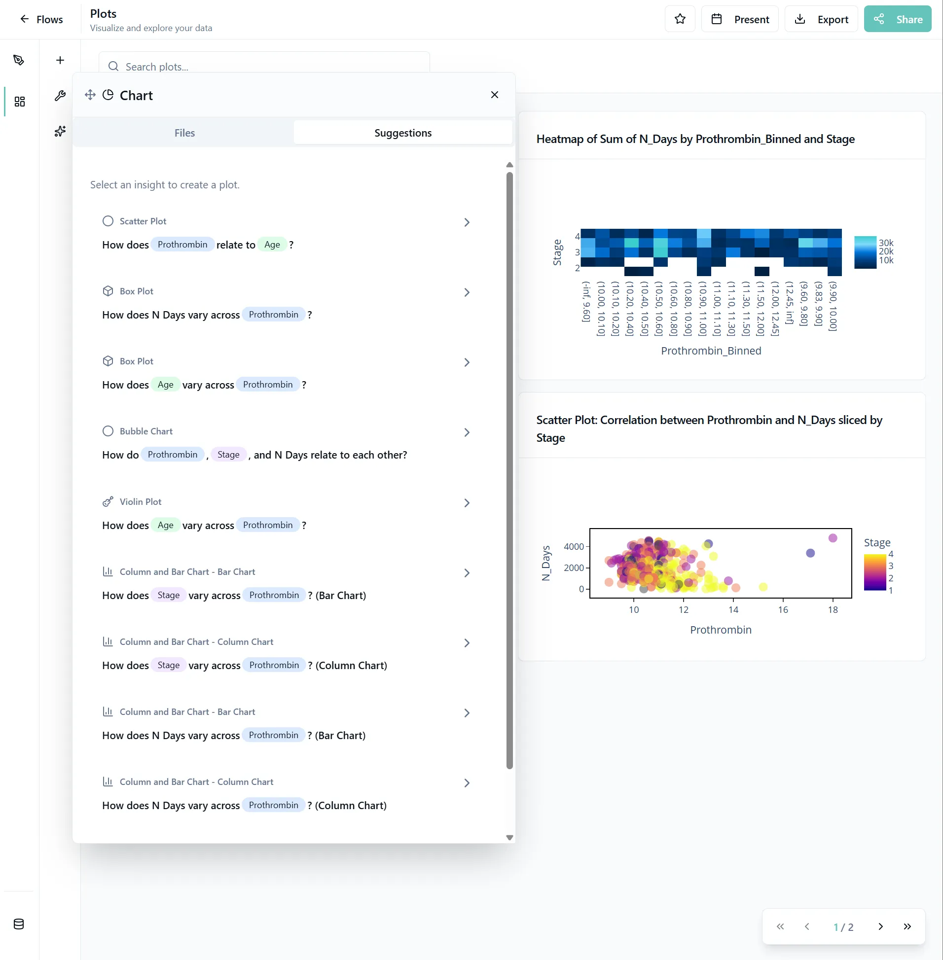

Add the plots by clicking on the questions. At the top, you'll see what type of plot you will create. The colored chips indicate what columns you are using for the plots. Same columns across different AI-suggested plots have the same colors.
AI-Powered Features:
- AI recommends the best visualizations based on your data
- Automatic selection of appropriate axes, colors, and scales
- Smart defaults that understand your data structure
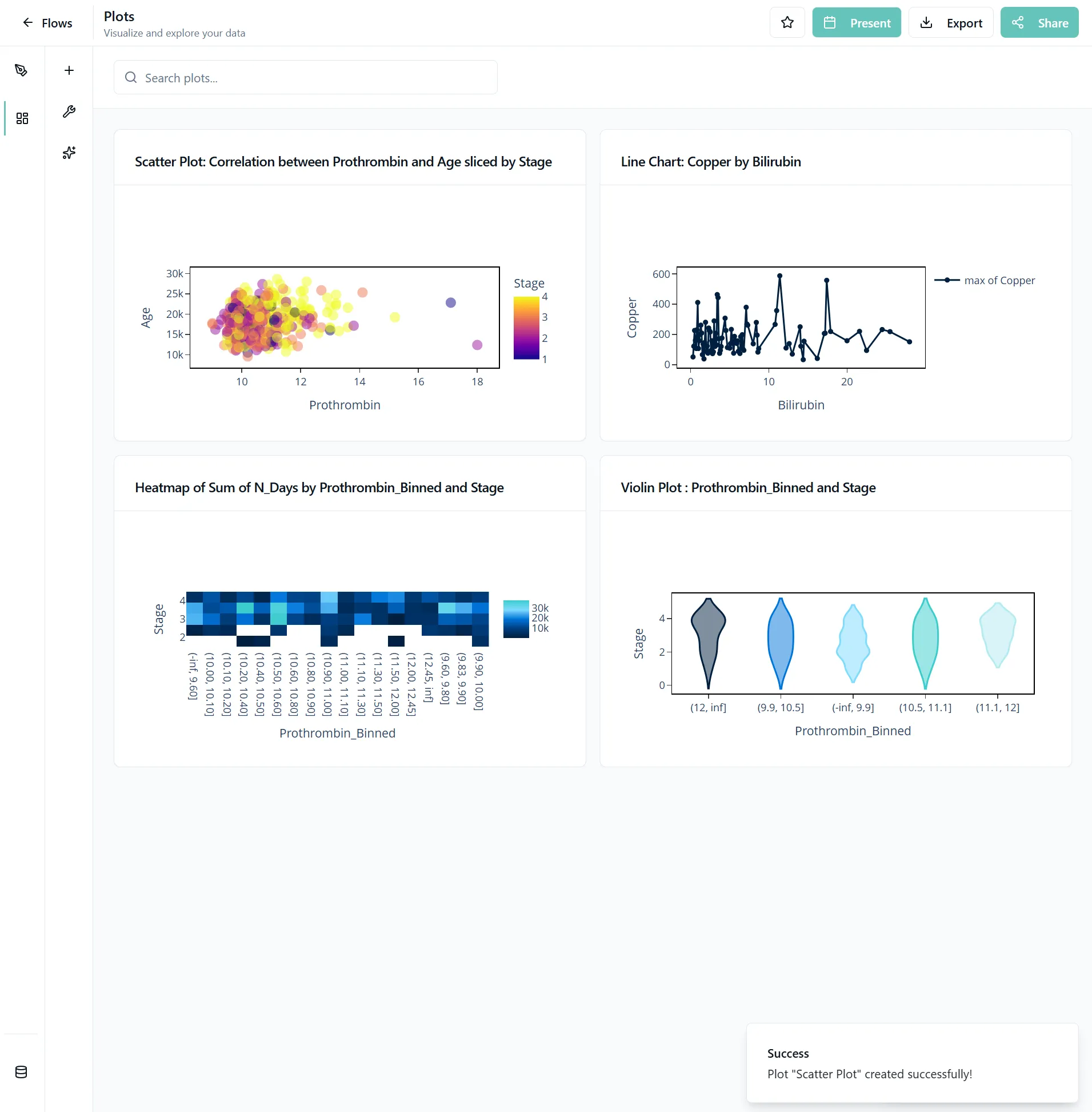
8. Present Your Plots
When you're done creating your dashboard, click the present button to view your plots in fullscreen mode. Use the arrows to navigate between plots.

9. Share or Export
To send the dashboards you created to someone, click the share or export button right next to the present button. Individual plots can be downloaded through the plot toolbar that appears when you hover over a plot.
You might want to arrange the plots differently before sharing them. Simply drag the plots larger or smaller or change their places.
Export Options:
- Download plots as high-quality PDFs
- Export as PNG, JPG, or SVG
- Share plots with colleagues via secure links
10. Zoom in for the Details
Hover to see detailed information about data points.
If you want to see an area closer, scroll into a plot and put the mouse around your area of interest. To zoom out, simply double-click in your plot.
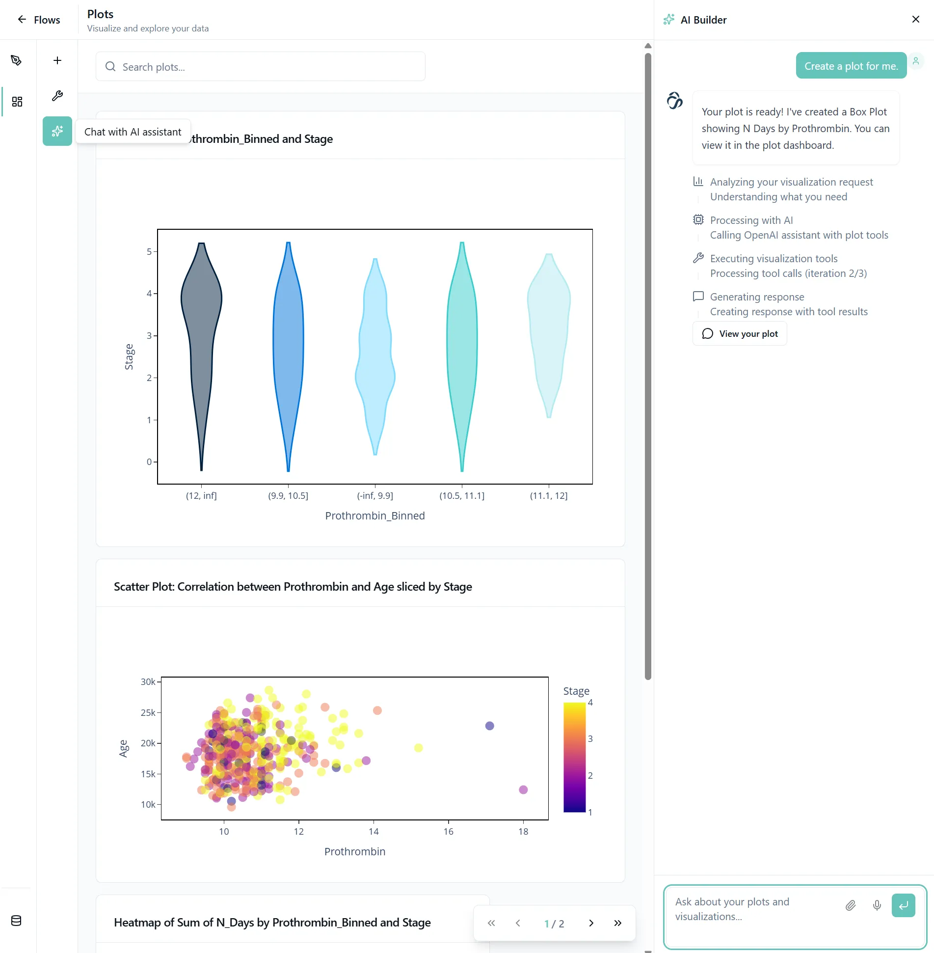
11. Use the Chat to Create
Open the AI chat builder by clicking on the star icon in the navigation bar of the plots page.
Then send a simple message like "Create a plot for me".

What you can do with AI Chat:
- Create plots conversationally: Use commands like "Create a bar chart showing sales by region"
- Compare plots: Ask the AI to compare different visualizations
- Specify details: Request specific plot types or columns to use
- Get insights: AI highlights interesting patterns, trends, and anomalies in your data
- Interpret results: Get AI explanations of what your plots show
- Optimization tips: Receive suggestions for improving plot clarity and impact
Upcoming
- API Access: Create plots programmatically via API or get plots via API
- External Tool Integration: Connect with your existing analytics tools
- Webhook Support: Trigger actions based on data or trend changes
Responsible Developers: ui:Aman, api:Aditya.